


As a beginner in Power BI, I wanted to create reports quickly and effectively. To achieve this, I referred to a Power BI report created by Prathyusha (link to the blog: prathy.com/portfolio/global-landslide-data-..), which showcased global landslide data.
To start off, I downloaded the source file and connected it to a CSV file. Alternatively, we can also connect to the web URL: data.nasa.gov/api/views/dd9e-wu2v/rows.csv.
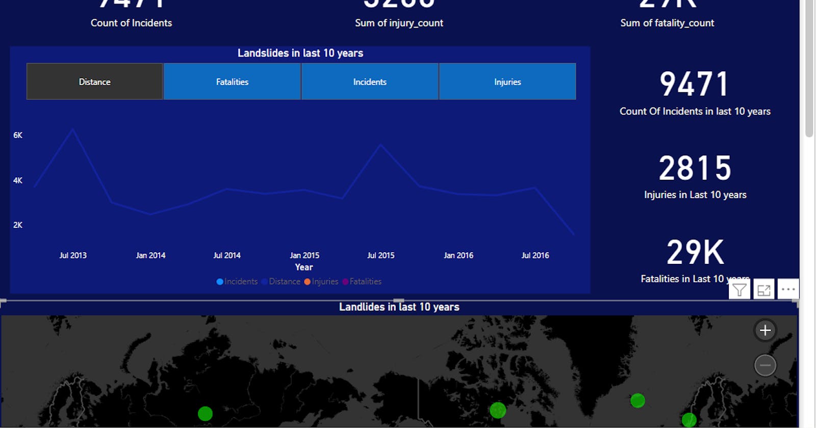
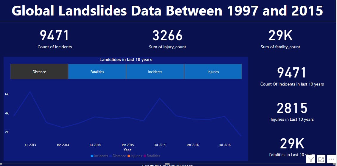
Once connected, I added an eye-catching title and began working on the visuals. Starting with some simple visuals like tiles, I aggregated values to create a DAX Query that contained the Count Of Incidents, the Sum Of Distance, the Sum Of Injuries, and the Sum Of Fatalities. Additionally, I created a Slicer column and linked it to a Line Chart visual to display data separately for Total Incidents, Total Distance, Total Injuries, and Total Fatalities across the year. I also included individual tiles to show the Total Incidents, Total Injuries, and Total Fatalities. Lastly, I added a relative filter to include only the last 10 years of data.
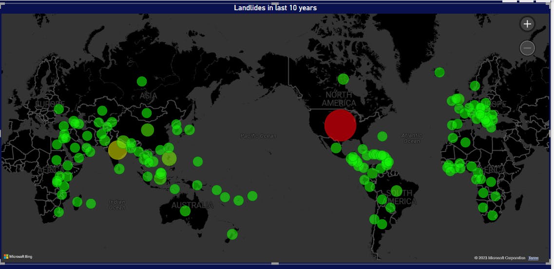
Next, I added a Microsoft Bing Map visual to the report. I used the country name for the location field and included the Count Of Event_id for the Bubble Size. Furthermore, I added conditional formatting to show different colors for higher incidents.
Finally, I added a Table visual to display tabular data for each country. I used conditional formatting of Data Bars for numerical columns to make the report more visually appealing.

Overall, this report helped me understand the basics of Power BI quickly and effectively.
You can access the pix file for this report on my GitHub page at this link: Landslide Data Report.